
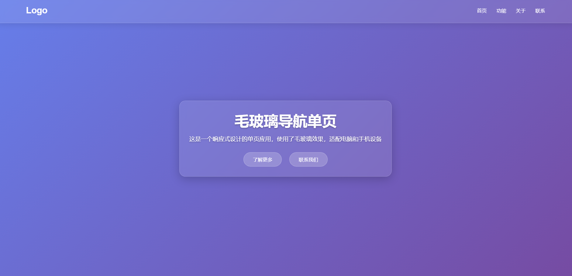
毛玻璃导航单页
- HTML
- 2025-11-02
- 62热度
- 0评论
毛玻璃导航单页,这是一款HTML导航单页,支持电脑/手机自适应,具体不说了,自测。
<!DOCTYPE html>
<html lang="zh-CN">
<head>
<meta charset="UTF-8">
<meta name="viewport" content="width=device-width, initial-scale=1.0">
<title>毛玻璃导航单页</title>
<style>
* {
margin: 0;
padding: 0;
box-sizing: border-box;
}
body {
font-family: 'Arial', sans-serif;
background: linear-gradient(135deg, #667eea 0%, #764ba2 100%);
min-height: 100vh;
display: flex;
flex-direction: column;
background-attachment: fixed;
}
.hero {
height: 100vh;
display: flex;
align-items: center;
justify-content: center;
position: relative;
text-align: center;
color: white;
}
.hero::before {
content: '';
position: absolute;
top: 0;
left: 0;
right: 0;
bottom: 0;
background: url('https://picsum.photos/1920/1080?random=1') center/cover no-repeat;
filter: blur(5px);
z-index: -1;
}
.hero-content {
max-width: 800px;
padding: 2rem;
background: rgba(255, 255, 255, 0.1);
backdrop-filter: blur(10px);
border-radius: 20px;
border: 1px solid rgba(255, 255, 255, 0.2);
box-shadow: 0 8px 32px rgba(0, 0, 0, 0.2);
}
.hero h1 {
font-size: 3rem;
margin-bottom: 1rem;
text-shadow: 0 2px 4px rgba(0, 0, 0, 0.3);
}
.hero p {
font-size: 1.2rem;
margin-bottom: 2rem;
text-shadow: 0 2px 4px rgba(0, 0, 0, 0.3);
}
.btn {
display: inline-block;
padding: 12px 30px;
background: rgba(255, 255, 255, 0.2);
color: white;
text-decoration: none;
border-radius: 30px;
transition: all 0.3s ease;
border: 1px solid rgba(255, 255, 255, 0.3);
margin: 0 10px;
}
.btn:hover {
background: rgba(255, 255, 255, 0.3);
transform: translateY(-3px);
}
.nav-container {
position: fixed;
top: 0;
left: 0;
right: 0;
z-index: 1000;
}
nav {
display: flex;
justify-content: space-between;
align-items: center;
padding: 1.5rem 5%;
background: rgba(255, 255, 255, 0.1);
backdrop-filter: blur(10px);
border-bottom: 1px solid rgba(255, 255, 255, 0.2);
box-shadow: 0 4px 20px rgba(0, 0, 0, 0.1);
}
.logo {
font-size: 1.8rem;
font-weight: bold;
color: white;
text-decoration: none;
}
.nav-links {
display: flex;
list-style: none;
}
.nav-links li {
margin-left: 2rem;
}
.nav-links a {
color: white;
text-decoration: none;
font-weight: 500;
transition: opacity 0.3s ease;
}
.nav-links a:hover {
opacity: 0.8;
}
.menu-toggle {
display: none;
background: none;
border: none;
color: white;
font-size: 1.5rem;
cursor: pointer;
}
.section {
padding: 5rem 5%;
background: rgba(255, 255, 255, 0.05);
backdrop-filter: blur(5px);
border-bottom: 1px solid rgba(255, 255, 255, 0.1);
}
.section h2 {
color: white;
font-size: 2.5rem;
margin-bottom: 2rem;
text-align: center;
}
.features {
display: grid;
grid-template-columns: repeat(auto-fit, minmax(300px, 1fr));
gap: 2rem;
}
.feature-card {
background: rgba(255, 255, 255, 0.1);
padding: 2rem;
border-radius: 15px;
text-align: center;
backdrop-filter: blur(5px);
border: 1px solid rgba(255, 255, 255, 0.2);
transition: transform 0.3s ease;
}
.feature-card:hover {
transform: translateY(-10px);
}
.feature-card h3 {
color: white;
margin-bottom: 1rem;
}
.feature-card p {
color: rgba(255, 255, 255, 0.8);
}
footer {
text-align: center;
padding: 2rem;
color: white;
background: rgba(0, 0, 0, 0.2);
backdrop-filter: blur(5px);
}
@media (max-width: 768px) {
.nav-links {
position: fixed;
top: 70px;
left: 0;
right: 0;
background: rgba(255, 255, 255, 0.1);
backdrop-filter: blur(10px);
border-bottom: 1px solid rgba(255, 255, 255, 0.2);
flex-direction: column;
align-items: center;
padding: 1rem 0;
clip-path: polygon(0 0, 100% 0, 100% 0, 0 0);
transition: clip-path 0.4s ease;
}
.nav-links.active {
clip-path: polygon(0 0, 100% 0, 100% 100%, 0 100%);
}
.nav-links li {
margin: 1rem 0;
}
.menu-toggle {
display: block;
}
.hero h1 {
font-size: 2.2rem;
}
.hero p {
font-size: 1rem;
}
.section {
padding: 3rem 5%;
}
.section h2 {
font-size: 2rem;
}
}
@media (max-width: 480px) {
nav {
padding: 1rem 5%;
}
.hero-content {
padding: 1.5rem;
}
.hero h1 {
font-size: 1.8rem;
}
.btn {
display: block;
margin: 10px auto;
width: 80%;
}
}
</style>
</head>
<body>
<div class="nav-container">
<nav>
<a href="#" class="logo">Logo</a>
<ul class="nav-links">
<li><a href="#home">首页</a></li>
<li><a href="#features">功能</a></li>
<li><a href="#about">关于</a></li>
<li><a href="#contact">联系</a></li>
</ul>
<button class="menu-toggle">☰</button>
</nav>
</div>
<div class="hero" id="home">
<div class="hero-content">
<h1>毛玻璃导航单页</h1>
<p>这是一个响应式设计的单页应用,使用了毛玻璃效果,适配电脑和手机设备</p>
<a href="#features" class="btn">了解更多</a>
<a href="#contact" class="btn">联系我们</a>
</div>
</div>
<section class="section" id="features">
<h2>功能特色</h2>
<div class="features">
<div class="feature-card">
<h3>响应式设计</h3>
<p>完美适配各种屏幕尺寸,从桌面电脑到移动设备</p>
</div>
<div class="feature-card">
<h3>毛玻璃效果</h3>
<p>使用backdrop-filter实现现代感的毛玻璃效果</p>
</div>
<div class="feature-card">
<h3>优雅动画</h3>
<p>流畅的过渡动画,提升用户体验</p>
</div>
</div>
</section>
<section class="section" id="about">
<h2>关于我们</h2>
<div class="hero-content">
<p>我们致力于创造美观且实用的网页设计,使用最新的前端技术为用户提供最佳体验。</p>
</div>
</section>
<section class="section" id="contact">
<h2>联系我们</h2>
<div class="hero-content">
<p>如果您有任何问题或建议,请随时与我们联系</p>
<a href="mailto:contact@example.com" class="btn">发送邮件</a>
</div>
</section>
<footer>
<p>© 2023 毛玻璃导航单页. 保留所有权利.</p>
</footer>
<script>
document.addEventListener('DOMContentLoaded', function() {
const menuToggle = document.querySelector('.menu-toggle');
const navLinks = document.querySelector('.nav-links');
menuToggle.addEventListener('click', function() {
navLinks.classList.toggle('active');
});
// 平滑滚动
document.querySelectorAll('a[href^="#"]').forEach(anchor => {
anchor.addEventListener('click', function(e) {
e.preventDefault();
const targetId = this.getAttribute('href');
if(targetId === '#') return;
const targetElement = document.querySelector(targetId);
if(targetElement) {
window.scrollTo({
top: targetElement.offsetTop - 70,
behavior: 'smooth'
});
// 关闭移动端菜单
navLinks.classList.remove('active');
}
});
});
// 导航栏背景变化
window.addEventListener('scroll', function() {
const nav = document.querySelector('nav');
if(window.scrollY > 50) {
nav.style.background = 'rgba(0, 0, 0, 0.3)';
} else {
nav.style.background = 'rgba(255, 255, 255, 0.1)';
}
});
});
</script>
</body>
</html>