
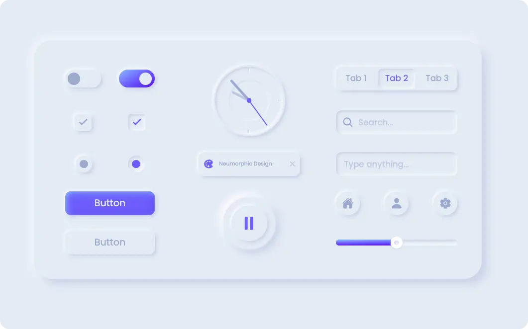
本页面展示了基于CSS Neumorphism新拟态设计的前端UI组件示例,包含开关、复选框、单选按钮、按钮、时钟、搜索框、分段控制、图标、滑块等交互元素,使用HTML5、CSS3、JavaScript及Ionicons、Material Icons等技术,适合UI设计参考与前端开发学习。
<!DOCTYPE html>
<html lang="zh">
<head>
<meta charset="UTF-8" />
<title>新拟态组件</title>
<link
href="https://fonts.geekzu.org/css?family=Poppins:400,600,700&display=swap"
rel="stylesheet"
/>
<link
href="https://fonts.geekzu.org/icon?family=Material+Icons"
rel="stylesheet"
/>
<script
src="https://kit.fontawesome.com/f0601b0fb2.js"
crossorigin="anonymous"
></script>
<script
type="module"
src="https://unpkg.com/ionicons@5.0.0/dist/ionicons/ionicons.esm.js"
></script>
<script
nomodule=""
src="https://unpkg.com/ionicons@5.0.0/dist/ionicons/ionicons.js"
></script>
<meta name="viewport" content="width=device-width, initial-scale=1" />
<link
rel="stylesheet"
href="https://public.codepenassets.com/css/normalize-5.0.0.min.css"
/>
<style>
:root {
--primary-light: #8abdff;
--primary: #6d5dfc;
--primary-dark: #5b0eeb;
--white: #ffffff;
--greyLight-1: #e4ebf5;
--greyLight-2: #c8d0e7;
--greyLight-3: #bec8e4;
--greyDark: #9baacf;
}
*,
*::before,
*::after {
margin: 0;
padding: 0;
box-sizing: inherit;
}
html {
box-sizing: border-box;
font-size: 62.5%;
overflow-y: scroll;
background: var(--greyLight-1);
}
@media screen and (min-width: 900px) {
html {
font-size: 75%;
}
}
.container {
min-height: 100vh;
display: flex;
justify-content: center;
align-items: center;
font-family: "Poppins", sans-serif;
background: var(--greyLight-1);
}
.components {
width: 75rem;
height: 40rem;
border-radius: 3rem;
box-shadow: 0.8rem 0.8rem 1.4rem var(--greyLight-2),
-0.2rem -0.2rem 1.8rem var(--white);
padding: 4rem;
display: grid;
grid-template-columns: 17.6rem 19rem 20.4rem;
grid-template-rows: repeat(autofit, -webkit-min-content);
grid-template-rows: repeat(autofit, min-content);
grid-column-gap: 5rem;
grid-row-gap: 2.5rem;
align-items: center;
}
/* SWITCH */
.switch {
grid-column: 1/2;
display: grid;
grid-template-columns: repeat(2, -webkit-min-content);
grid-template-columns: repeat(2, min-content);
grid-gap: 3rem;
justify-self: center;
}
.switch input {
display: none;
}
.switch__1,
.switch__2 {
width: 6rem;
}
.switch__1 label,
.switch__2 label {
display: flex;
align-items: center;
width: 100%;
height: 3rem;
box-shadow: 0.3rem 0.3rem 0.6rem var(--greyLight-2),
-0.2rem -0.2rem 0.5rem var(--white);
background: rgba(255, 255, 255, 0);
position: relative;
cursor: pointer;
border-radius: 1.6rem;
}
.switch__1 label::after,
.switch__2 label::after {
content: "";
position: absolute;
left: 0.4rem;
width: 2.1rem;
height: 2.1rem;
border-radius: 50%;
background: var(--greyDark);
transition: all 0.4s ease;
}
.switch__1 label::before,
.switch__2 label::before {
content: "";
width: 100%;
height: 100%;
border-radius: inherit;
background: linear-gradient(
330deg,
var(--primary-dark) 0%,
var(--primary) 50%,
var(--primary-light) 100%
);
opacity: 0;
transition: all 0.4s ease;
}
.switch input:checked ~ label::before {
opacity: 1;
}
.switch input:checked ~ label::after {
left: 57%;
background: var(--greyLight-1);
}
/* CHECKBOX */
.checkbox {
grid-column: 1/2;
display: grid;
grid-template-columns: repeat(2, 6rem);
grid-gap: 3rem;
justify-content: center;
}
.checkbox input {
display: none;
}
.checkbox__1,
.checkbox__2 {
width: 6rem;
display: flex;
justify-content: center;
}
.checkbox__1 label,
.checkbox__2 label {
box-shadow: 0.3rem 0.3rem 0.6rem var(--greyLight-2),
-0.2rem -0.2rem 0.5rem var(--white);
cursor: pointer;
position: relative;
display: flex;
justify-content: center;
align-items: center;
border-radius: 0.5rem;
width: 2.8rem;
height: 2.8rem;
}
.checkbox__1 label:hover i,
.checkbox__2 label:hover i {
color: var(--primary);
}
.checkbox__1 label i,
.checkbox__2 label i {
font-size: 1.8rem;
font-weight: 700;
color: var(--greyDark);
transition: 0.3s ease;
}
.checkbox__1 input:checked ~ label,
.checkbox__2 input:checked ~ label {
box-shadow: inset 0.2rem 0.2rem 0.5rem var(--greyLight-2),
inset -0.2rem -0.2rem 0.5rem var(--white);
}
.checkbox__1 input:checked ~ label i,
.checkbox__2 input:checked ~ label i {
color: var(--primary);
}
/* RADIO */
.radio {
grid-column: 1/2;
display: grid;
grid-template-columns: repeat(2, 1fr);
justify-items: center;
}
.radio input {
display: none;
}
.radio__1 input:checked ~ label,
.radio__2 input:checked ~ label {
box-shadow: inset 0.2rem 0.2rem 0.5rem var(--greyLight-2),
inset -0.2rem -0.2rem 0.5rem var(--white);
}
.radio__1 input:checked ~ label::after,
.radio__2 input:checked ~ label::after {
background: var(--primary);
}
.radio__1 label,
.radio__2 label {
box-shadow: 0.3rem 0.3rem 0.6rem var(--greyLight-2),
-0.2rem -0.2rem 0.5rem var(--white);
position: relative;
display: flex;
justify-content: center;
align-items: center;
cursor: pointer;
width: 2.8rem;
height: 2.8rem;
border-radius: 50%;
}
.radio__1 label:hover::after,
.radio__2 label:hover::after {
background: var(--primary);
}
.radio__1 label::after,
.radio__2 label::after {
content: "";
position: absolute;
width: 1.4rem;
height: 1.4rem;
background: var(--greyDark);
border-radius: 50%;
transition: 0.3s ease;
}
/* BUTTONS */
.btn {
width: 15rem;
height: 4rem;
border-radius: 1rem;
box-shadow: 0.3rem 0.3rem 0.6rem var(--greyLight-2),
-0.2rem -0.2rem 0.5rem var(--white);
justify-self: center;
display: flex;
align-items: center;
justify-content: center;
cursor: pointer;
transition: 0.3s ease;
}
.btn__primary {
grid-column: 1/2;
grid-row: 4/5;
background: var(--primary);
box-shadow: inset 0.2rem 0.2rem 1rem var(--primary-light),
inset -0.2rem -0.2rem 1rem var(--primary-dark),
0.3rem 0.3rem 0.6rem var(--greyLight-2),
-0.2rem -0.2rem 0.5rem var(--white);
color: var(--greyLight-1);
}
.btn__primary:hover {
color: var(--white);
}
.btn__primary:active {
box-shadow: inset 0.2rem 0.2rem 1rem var(--primary-dark),
inset -0.2rem -0.2rem 1rem var(--primary-light);
}
.btn__secondary {
grid-column: 1/2;
grid-row: 5/6;
color: var(--greyDark);
}
.btn__secondary:hover {
color: var(--primary);
}
.btn__secondary:active {
box-shadow: inset 0.2rem 0.2rem 0.5rem var(--greyLight-2),
inset -0.2rem -0.2rem 0.5rem var(--white);
}
.btn p {
font-size: 1.6rem;
}
/* CLOCK */
.clock {
grid-column: 2/3;
grid-row: 1/3;
width: 12rem;
height: 12rem;
justify-self: center;
box-shadow: 0.3rem 0.3rem 0.6rem var(--greyLight-2),
-0.2rem -0.2rem 0.5rem var(--white);
border-radius: 50%;
display: flex;
justify-content: center;
align-items: center;
position: relative;
}
.clock .hand {
position: absolute;
transform-origin: bottom;
bottom: 6rem;
border-radius: 0.2rem;
z-index: 200;
}
.clock .hours {
width: 0.4rem;
height: 3.2rem;
background: var(--greyLight-3);
}
.clock .minutes {
width: 0.4rem;
height: 4.6rem;
background: var(--greyDark);
}
.clock .seconds {
width: 0.2rem;
height: 5.2rem;
background: var(--primary);
}
.clock .point {
position: absolute;
width: 0.8rem;
height: 0.8rem;
border-radius: 50%;
background: var(--primary);
z-index: 300;
}
.clock .marker {
width: 95%;
height: 95%;
border-radius: 50%;
position: relative;
box-shadow: inset 0.2rem 0.2rem 0.5rem var(--greyLight-2),
inset -0.2rem -0.2rem 0.5rem var(--white);
}
.clock .marker::after {
content: "";
width: 60%;
height: 60%;
position: absolute;
box-shadow: inset 1px 1px 1px var(--greyLight-2),
inset -1px -1px 1px var(--white);
border-radius: 50%;
top: 20%;
left: 20%;
filter: blur(1px);
}
.clock .marker__1,
.clock .marker__2,
.clock .marker__3,
.clock .marker__4 {
position: absolute;
border-radius: 0.1rem;
box-shadow: inset 1px 1px 1px var(--greyLight-2),
inset -1px -1px 1px var(--white);
}
.clock .marker__1,
.clock .marker__2 {
width: 0.2rem;
height: 0.6rem;
left: 5.6rem;
}
.clock .marker__3,
.clock .marker__4 {
width: 0.6rem;
height: 0.2rem;
top: 5.6rem;
}
.clock .marker__1 {
top: 2%;
}
.clock .marker__2 {
top: 98%;
transform: translateY(-0.6rem);
}
.clock .marker__3 {
left: 2%;
}
.clock .marker__4 {
left: 98%;
transform: translateX(-0.6rem);
}
/* CHIP */
.chip {
grid-column: 2/3;
grid-row: 3/4;
justify-self: center;
width: 17rem;
height: 4rem;
border-radius: 1rem;
box-shadow: 0.3rem 0.3rem 0.6rem var(--greyLight-2),
-0.2rem -0.2rem 0.5rem var(--white);
display: flex;
justify-content: space-between;
align-items: center;
}
.chip__icon {
width: 3rem;
height: 3rem;
border-radius: 1rem;
margin: 0 0 0 0.2rem;
display: flex;
justify-content: center;
align-items: center;
font-size: 1.8rem;
color: var(--primary);
}
.chip p {
font-size: 0.9rem;
margin-left: -1.8rem;
color: var(--greyDark);
}
.chip__close {
width: 1.6rem;
height: 1.6rem;
margin: 0 0.5rem;
display: flex;
font-size: 1.6rem;
color: var(--greyLight-3);
cursor: pointer;
}
/* PLAY BUTTON */
.circle {
grid-column: 2/3;
grid-row: 4/6;
width: 9rem;
height: 100%;
justify-self: center;
border-radius: 1rem;
display: grid;
grid-template-rows: 1fr;
justify-items: center;
align-items: center;
}
.circle__btn {
grid-row: 1/2;
grid-column: 1/2;
width: 6rem;
height: 6rem;
display: flex;
margin: 0.6rem;
justify-content: center;
align-items: center;
border-radius: 50%;
font-size: 3.2rem;
color: var(--primary);
z-index: 300;
background: var(--greyLight-1);
box-shadow: 0.3rem 0.3rem 0.6rem var(--greyLight-2),
-0.2rem -0.2rem 0.5rem var(--white);
cursor: pointer;
position: relative;
}
.circle__btn.shadow {
box-shadow: inset 0.2rem 0.2rem 0.5rem var(--greyLight-2),
inset -0.2rem -0.2rem 0.5rem var(--white);
}
.circle__btn .play {
position: absolute;
opacity: 0;
transition: all 0.2s linear;
}
.circle__btn .play.visibility {
opacity: 1;
}
.circle__btn .pause {
position: absolute;
transition: all 0.2s linear;
}
.circle__btn .pause.visibility {
opacity: 0;
}
.circle__back-1,
.circle__back-2 {
grid-row: 1/2;
grid-column: 1/2;
width: 6rem;
height: 6rem;
border-radius: 50%;
filter: blur(1px);
z-index: 100;
}
.circle__back-1 {
box-shadow: 0.4rem 0.4rem 0.8rem var(--greyLight-2),
-0.4rem -0.4rem 0.8rem var(--white);
background: linear-gradient(
to bottom right,
var(--greyLight-2) 0%,
var(--white) 100%
);
-webkit-animation: waves 4s linear infinite;
animation: waves 4s linear infinite;
}
.circle__back-1.paused {
-webkit-animation-play-state: paused;
animation-play-state: paused;
}
.circle__back-2 {
box-shadow: 0.4rem 0.4rem 0.8rem var(--greyLight-2),
-0.4rem -0.4rem 0.8rem var(--white);
-webkit-animation: waves 4s linear 2s infinite;
animation: waves 4s linear 2s infinite;
}
.circle__back-2.paused {
-webkit-animation-play-state: paused;
animation-play-state: paused;
}
/* FORM */
.form {
grid-column: 3/4;
grid-row: 3/4;
}
.form__input {
width: 20.4rem;
height: 4rem;
border: none;
border-radius: 1rem;
font-size: 1.4rem;
padding-left: 1.4rem;
box-shadow: inset 0.2rem 0.2rem 0.5rem var(--greyLight-2),
inset -0.2rem -0.2rem 0.5rem var(--white);
background: none;
font-family: inherit;
color: var(--greyDark);
}
.form__input::-moz-placeholder {
color: var(--greyLight-3);
}
.form__input:-ms-input-placeholder {
color: var(--greyLight-3);
}
.form__input::placeholder {
color: var(--greyLight-3);
}
.form__input:focus {
outline: none;
box-shadow: 0.3rem 0.3rem 0.6rem var(--greyLight-2),
-0.2rem -0.2rem 0.5rem var(--white);
}
/* SEARCH */
.search {
grid-column: 3/4;
grid-row: 2/3;
position: relative;
display: flex;
align-items: center;
}
.search__input {
width: 20.4rem;
height: 4rem;
border: none;
border-radius: 1rem;
font-size: 1.4rem;
padding-left: 3.8rem;
box-shadow: inset 0.2rem 0.2rem 0.5rem var(--greyLight-2),
inset -0.2rem -0.2rem 0.5rem var(--white);
background: none;
font-family: inherit;
color: var(--greyDark);
}
.search__input::-moz-placeholder {
color: var(--greyLight-3);
}
.search__input:-ms-input-placeholder {
color: var(--greyLight-3);
}
.search__input::placeholder {
color: var(--greyLight-3);
}
.search__input:focus {
outline: none;
box-shadow: 0.3rem 0.3rem 0.6rem var(--greyLight-2),
-0.2rem -0.2rem 0.5rem var(--white);
}
.search__input:focus + .search__icon {
color: var(--primary);
}
.search__icon {
height: 2rem;
position: absolute;
font-size: 2rem;
padding: 0 1rem;
display: flex;
color: var(--greyDark);
transition: 0.3s ease;
}
/* SEGMENTED-CONTROL */
.segmented-control {
grid-column: 3/4;
grid-row: 1/2;
width: 20.4rem;
height: 4rem;
box-shadow: 0.3rem 0.3rem 0.6rem var(--greyLight-2),
-0.2rem -0.2rem 0.5rem var(--white);
border-radius: 1rem;
display: flex;
align-items: center;
position: relative;
}
.segmented-control input {
display: none;
}
.segmented-control > input:checked + label {
transition: all 0.5s ease;
color: var(--primary);
}
.segmented-control__1,
.segmented-control__2,
.segmented-control__3 {
width: 6.8rem;
height: 3.6rem;
font-size: 1.4rem;
display: flex;
justify-content: center;
align-items: center;
cursor: pointer;
color: var(--greyDark);
transition: all 0.5s ease;
}
.segmented-control__1:hover,
.segmented-control__2:hover,
.segmented-control__3:hover {
color: var(--primary);
}
.segmented-control__color {
position: absolute;
height: 3.4rem;
width: 6.2rem;
margin-left: 0.3rem;
border-radius: 0.8rem;
box-shadow: inset 0.2rem 0.2rem 0.5rem var(--greyLight-2),
inset -0.2rem -0.2rem 0.5rem var(--white);
pointer-events: none;
}
#tab-1:checked ~ .segmented-control__color {
transform: translateX(0);
transition: transform 0.3s cubic-bezier(0.645, 0.045, 0.355, 1);
}
#tab-2:checked ~ .segmented-control__color {
transform: translateX(6.8rem);
transition: transform 0.3s cubic-bezier(0.645, 0.045, 0.355, 1);
}
#tab-3:checked ~ .segmented-control__color {
transform: translateX(13.6rem);
transition: transform 0.3s cubic-bezier(0.645, 0.045, 0.355, 1);
}
/* ICONS */
.icon {
grid-column: 3/4;
grid-row: 4/5;
display: flex;
justify-content: space-between;
}
.icon__account,
.icon__home,
.icon__settings {
width: 4rem;
height: 4rem;
border-radius: 50%;
box-shadow: 0.3rem 0.3rem 0.6rem var(--greyLight-2),
-0.2rem -0.2rem 0.5rem var(--white);
display: flex;
justify-content: center;
align-items: center;
font-size: 2rem;
cursor: pointer;
color: var(--greyDark);
transition: all 0.5s ease;
}
.icon__account:active,
.icon__home:active,
.icon__settings:active {
box-shadow: inset 0.2rem 0.2rem 0.5rem var(--greyLight-2),
inset -0.2rem -0.2rem 0.5rem var(--white);
color: var(--primary);
}
.icon__account:hover,
.icon__home:hover,
.icon__settings:hover {
color: var(--primary);
}
/* RANGE-SLIDER */
.slider {
grid-column: 3/4;
grid-row: 5/6;
align-self: center;
display: flex;
flex-direction: column;
}
.slider__box {
width: 100%;
height: 1rem;
cursor: pointer;
box-shadow: inset 0.2rem 0.2rem 0.5rem var(--greyLight-2),
inset -0.2rem -0.2rem 0.5rem var(--white);
border-radius: 1rem;
position: relative;
display: flex;
justify-content: center;
align-items: center;
}
.slider__btn {
width: 2rem;
height: 2rem;
border-radius: 50%;
background: var(--white);
position: absolute;
box-shadow: 0px 0.1rem 0.3rem 0px var(--greyLight-3);
z-index: 200;
display: flex;
justify-content: center;
align-items: center;
}
.slider__btn:hover ~ .slider__tooltip {
opacity: 1;
}
.slider__btn::after {
content: "";
position: absolute;
width: 0.8rem;
height: 0.8rem;
border-radius: 50%;
box-shadow: inset 0.2rem 0.2rem 0.5rem var(--greyLight-2),
inset -0.2rem -0.2rem 0.5rem var(--white);
}
.slider__color {
height: 100%;
width: 50%;
position: absolute;
left: 0;
z-index: 100;
border-radius: inherit;
background: var(--primary);
background: linear-gradient(
-1deg,
var(--primary-dark) 0%,
var(--primary) 50%,
var(--primary-light) 100%
);
}
.slider__tooltip {
position: absolute;
top: 2.6rem;
height: 2.5rem;
width: 3rem;
border-radius: 0.6rem;
display: flex;
justify-content: center;
align-items: center;
font-size: 1.2rem;
color: var(--primary);
box-shadow: 0.3rem 0.3rem 0.6rem var(--greyLight-2),
-0.2rem -0.2rem 0.5rem var(--white);
opacity: 0;
transition: opacity 0.3s ease;
}
@-webkit-keyframes waves {
0% {
transform: scale(1);
opacity: 1;
}
50% {
opacity: 1;
}
100% {
transform: scale(2);
opacity: 0;
}
}
@keyframes waves {
0% {
transform: scale(1);
opacity: 1;
}
50% {
opacity: 1;
}
100% {
transform: scale(2);
opacity: 0;
}
}
.dribbble {
position: fixed;
font-size: 2.6rem;
right: 2rem;
bottom: 1rem;
color: #ea4c89;
}
</style>
</head>
<body>
<div class="container">
<div class="components">
<div class="switch">
<div class="switch__1">
<input id="switch-1" type="checkbox" />
<label for="switch-1"></label>
</div>
<div class="switch__2">
<input id="switch-2" type="checkbox" checked />
<label for="switch-2"></label>
</div>
</div>
<div class="checkbox">
<div class="checkbox__1">
<input id="checkbox-1" type="checkbox" />
<label for="checkbox-1"> <i class="material-icons">done</i></label>
</div>
<div class="checkbox__2">
<input id="checkbox-2" type="checkbox" checked />
<label for="checkbox-2"> <i class="material-icons">done</i></label>
</div>
</div>
<div class="radio">
<div class="radio__1">
<input id="radio-1" type="radio" name="radio" value="1" />
<label for="radio-1"></label>
</div>
<div class="radio__2">
<input id="radio-2" type="radio" name="radio" value="2" checked />
<label for="radio-2"></label>
</div>
</div>
<div class="btn btn__primary"><p>Button</p></div>
<div class="btn btn__secondary"><p>Button</p></div>
<div class="clock">
<div class="hand hours"></div>
<div class="hand minutes"></div>
<div class="hand seconds"></div>
<div class="point"></div>
<div class="marker">
<span class="marker__1"></span>
<span class="marker__2"></span>
<span class="marker__3"></span>
<span class="marker__4"></span>
</div>
</div>
<div class="chip">
<div class="chip__icon">
<ion-icon name="color-palette"></ion-icon>
</div>
<p>Neumorphic Design</p>
<div class="chip__close">
<ion-icon name="close"></ion-icon>
</div>
</div>
<div class="circle">
<span class="circle__btn">
<ion-icon class="pause" name="pause"></ion-icon>
<ion-icon class="play" name="play"></ion-icon>
</span>
<span class="circle__back-1"></span>
<span class="circle__back-2"></span>
</div>
<div class="form">
<input
type="text"
class="form__input"
placeholder="Type anything..."
/>
</div>
<div class="search">
<input type="text" class="search__input" placeholder="Search..." />
<div class="search__icon">
<ion-icon name="search"></ion-icon>
</div>
</div>
<div class="segmented-control">
<input type="radio" name="radio2" value="3" id="tab-1" checked />
<label for="tab-1" class="segmented-control__1"> <p>Tab 1</p></label>
<input type="radio" name="radio2" value="4" id="tab-2" />
<label for="tab-2" class="segmented-control__2"> <p>Tab 2</p></label>
<input type="radio" name="radio2" value="5" id="tab-3" />
<label for="tab-3" class="segmented-control__3"> <p>Tab 3</p></label>
<div class="segmented-control__color"></div>
</div>
<div class="icon">
<div class="icon__home">
<ion-icon name="home"></ion-icon>
</div>
<div class="icon__account">
<ion-icon name="person"></ion-icon>
</div>
<div class="icon__settings">
<ion-icon name="settings"></ion-icon>
</div>
</div>
<div class="slider">
<div class="slider__box">
<span class="slider__btn" id="find"></span>
<span class="slider__color"></span>
<span class="slider__tooltip">50%</span>
</div>
</div>
</div>
</div>
<script>
/* clock */
const hours = document.querySelector(".hours");
const minutes = document.querySelector(".minutes");
const seconds = document.querySelector(".seconds");
/* play button */
const play = document.querySelector(".play");
const pause = document.querySelector(".pause");
const playBtn = document.querySelector(".circle__btn");
const wave1 = document.querySelector(".circle__back-1");
const wave2 = document.querySelector(".circle__back-2");
/* rate slider */
const container = document.querySelector(".slider__box");
const btn = document.querySelector(".slider__btn");
const color = document.querySelector(".slider__color");
const tooltip = document.querySelector(".slider__tooltip");
clock = () => {
let today = new Date();
let h = (today.getHours() % 12) + today.getMinutes() / 59; // 22 % 12 = 10pm
let m = today.getMinutes(); // 0 - 59
let s = today.getSeconds(); // 0 - 59
h *= 30; // 12 * 30 = 360deg
m *= 6;
s *= 6; // 60 * 6 = 360deg
rotation(hours, h);
rotation(minutes, m);
rotation(seconds, s);
// call every second
setTimeout(clock, 500);
};
rotation = (target, val) => {
target.style.transform = `rotate(${val}deg)`;
};
window.onload = clock();
dragElement = (target, btn) => {
target.addEventListener("mousedown", (e) => {
onMouseMove(e);
window.addEventListener("mousemove", onMouseMove);
window.addEventListener("mouseup", onMouseUp);
});
onMouseMove = (e) => {
e.preventDefault();
let targetRect = target.getBoundingClientRect();
let x = e.pageX - targetRect.left + 10;
if (x > targetRect.width) {
x = targetRect.width;
}
if (x < 0) {
x = 0;
}
btn.x = x - 10;
btn.style.left = btn.x + "px";
// get the position of the button inside the container (%)
let percentPosition = ((btn.x + 10) / targetRect.width) * 100;
// color width = position of button (%)
color.style.width = percentPosition + "%";
// move the tooltip when button moves, and show the tooltip
tooltip.style.left = btn.x - 5 + "px";
tooltip.style.opacity = 1;
// show the percentage in the tooltip
tooltip.textContent = Math.round(percentPosition) + "%";
};
onMouseUp = (e) => {
window.removeEventListener("mousemove", onMouseMove);
tooltip.style.opacity = 0;
btn.addEventListener("mouseover", function () {
tooltip.style.opacity = 1;
});
btn.addEventListener("mouseout", function () {
tooltip.style.opacity = 0;
});
};
};
dragElement(container, btn);
/* play button */
playBtn.addEventListener("click", function (e) {
e.preventDefault();
pause.classList.toggle("visibility");
play.classList.toggle("visibility");
playBtn.classList.toggle("shadow");
wave1.classList.toggle("paused");
wave2.classList.toggle("paused");
});
</script>
</body>
</html>


暂无评论
要发表评论,您必须先 登录