
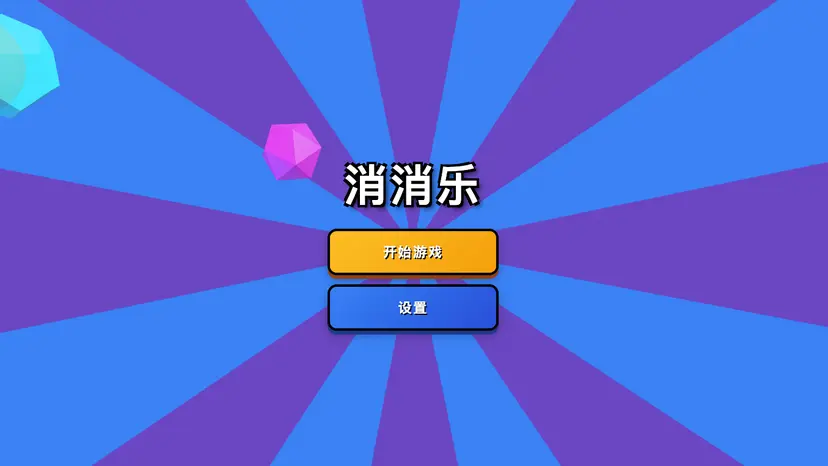
一个花里胡哨的确认按钮
- 网站相关
- 2025-08-07
- 131热度
- 0评论
交互式彩带动画确认按钮示例,基于HTML、CSS和GSAP实现3D悬停效果与点击粒子动画,适合前端交互动效开发与UI设计参考。
<!DOCTYPE html>
<html lang="zh">
  <head>
    <meta charset="UTF-8" />
    <title>一个花里胡哨的确认按钮</title>

    <style>
      .button {
        --background: #1e2235;
        --color: #f6f8ff;
        --shadow: rgba(0, 9, 61, 0.24);
        --cannon-dark: #a6accd;
        --cannon-light: #f6f8ff;
        --cannon-shadow: rgba(13, 15, 24, 0.9);
        --confetti-1: #892ab8;
        --confetti-2: #ea4c89;
        --confetti-3: #ffff04;
        --confetti-4: #4af2fd;
        --z-before: -6;
        display: block;
        outline: none;
        cursor: pointer;
        position: relative;
        border: 0;
        background: none;
        padding: 9px 22px 9px 16px;
        line-height: 26px;
        font-family: inherit;
        font-weight: 600;
        font-size: 14px;
        color: var(--color);
        -webkit-appearance: none;
        -webkit-tap-highlight-color: transparent;
        transition: transform var(--transform-duration, 0.4s);
        will-change: transform;
        transform-style: preserve-3d;
        transform: perspective(440px) rotateX(calc(var(--rx, 0) * 1deg))
          rotateY(calc(var(--ry, 0) * 1deg)) translateZ(0);
      }
      .button:hover {
        --transform-duration: 0.16s;
      }
      .button.success {
        --confetti-scale: 0;
        --stroke-dashoffset: 15;
      }
      .button:before {
        content: "";
        position: absolute;
        left: 0;
        top: 0;
        right: 0;
        bottom: 0;
        border-radius: 12px;
        transform: translateZ(calc(var(--z-before) * 1px));
        background: var(--background);
        box-shadow: 0 4px 8px var(--shadow);
      }
      .button .icon,
      .button span {
        display: inline-block;
        vertical-align: top;
        position: relative;
        z-index: 1;
      }
      .button .icon {
        --z: 2px;
        width: 24px;
        height: 14px;
        margin: 8px 16px 0 0;
        transform: translate(
            calc(var(--icon-x, 0) * 1px),
            calc(var(--icon-y, 0) * 1px)
          )
          translateZ(2px);
      }
      .button .icon .confetti {
        position: absolute;
        left: 17px;
        bottom: 9px;
      }
      .button .icon .confetti svg {
        width: 18px;
        height: 16px;
        display: block;
        stroke-width: 1px;
        fill: none;
        stroke-linejoin: round;
        stroke-linecap: round;
      }
      .button .icon .confetti svg * {
        transition: stroke-dashoffset 0.2s;
        stroke-dasharray: 15 20;
        stroke-dashoffset: var(--stroke-dashoffset, 0);
        stroke: var(--stroke-all, var(--stroke, var(--confetti-2)));
      }
      .button .icon .confetti svg *:nth-child(2) {
        --stroke: var(--confetti-3);
      }
      .button .icon .confetti svg *:nth-child(3) {
        --stroke: var(--confetti-1);
      }
      .button .icon .confetti .emitter {
        position: absolute;
        left: 4px;
        bottom: 4px;
        pointer-events: none;
      }
      .button .icon .confetti .emitter div {
        width: 4px;
        height: 4px;
        margin: -2px 0 0 -2px;
        border-radius: 1px;
        position: absolute;
        left: 0;
        top: 0;
        transform-style: preserve-3d;
        background: var(--confetti-all, var(--b, none));
      }
      .button .icon .confetti i {
        width: 4px;
        height: 4px;
        display: block;
        transform: scale(var(--confetti-scale, 0.5));
        position: absolute;
        transition: transform 0.25s;
        left: var(--left, -1px);
        top: var(--top, 3px);
        border-radius: var(--border-radius, 1px);
        background: var(--confetti-background, var(--confetti-3));
      }
      .button .icon .confetti i:nth-child(2) {
        --left: 9px;
        --top: -1px;
        --border-radius: 2px;
        --confetti-background: var(--confetti-4);
      }
      .button .icon .confetti i:nth-child(3) {
        --left: 5px;
        --top: 3px;
        --confetti-background: var(--confetti-1);
      }
      .button .icon .confetti i:nth-child(4) {
        --left: 10px;
        --top: 14px;
        --confetti-background: var(--confetti-2);
      }
      .button .icon .confetti i:nth-child(5) {
        --left: 9px;
        --top: 7px;
        --confetti-background: var(--confetti-4);
      }
      .button .icon .confetti i:nth-child(6) {
        --left: 6px;
        --top: 8px;
        --border-radius: 2px;
        --confetti-background: var(--confetti-2);
      }
      .button .icon .cannon {
        position: relative;
        width: 24px;
        height: 14px;
        transform: translate(0, 3px) rotate(-45deg);
        filter: drop-shadow(-2px 2px 2px var(--cannon-shadow));
      }
      .button .icon .cannon:before,
      .button .icon .cannon:after {
        content: "";
        display: block;
        height: 14px;
      }
      .button .icon .cannon:before {
        background: linear-gradient(
          var(--cannon-dark),
          var(--cannon-light) 50%,
          var(--cannon-dark)
        );
        width: 100%;
        -webkit-clip-path: polygon(25px -1px, 0 52%, 25px 15px);
        clip-path: polygon(25px -1px, 0 52%, 25px 15px);
      }
      .button .icon .cannon:after {
        width: 6px;
        position: absolute;
        right: -3px;
        top: 0;
        border-radius: 50%;
        box-shadow: inset 0 0 0 0.5px var(--cannon-light);
        background: linear-gradient(
          90deg,
          var(--cannon-dark),
          var(--cannon-light)
        );
      }
      .button.white {
        --background: #fff;
        --color: #1e2235;
        --border: #e1e6f9;
        --shadow: none;
        --cannon-dark: #103fc5;
        --cannon-light: #275efe;
        --cannon-shadow: rgba(0, 9, 61, 0.2);
      }
      .button.white:before {
        box-shadow: inset 0 0 0 1px var(--border);
      }
      .button.grey {
        --background: #404660;
        --cannon-shadow: rgba(13, 15, 24, 0.2);
        --cannon-dark: #d1d6ee;
        --cannon-light: #ffffff;
      }

      html {
        box-sizing: border-box;
        -webkit-font-smoothing: antialiased;
      }

      * {
        box-sizing: inherit;
      }
      *:before,
      *:after {
        box-sizing: inherit;
      }

      body {
        min-height: 100vh;
        display: flex;
        font-family: "Inter", Arial;
        justify-content: center;
        align-items: center;
        background: #f6f8ff;
      }
      body .button {
        margin: 0 12px;
      }
      body .dribbble {
        position: fixed;
        display: block;
        right: 20px;
        bottom: 20px;
      }
      body .dribbble img {
        display: block;
        height: 28px;
      }
      body .twitter {
        position: fixed;
        display: block;
        right: 64px;
        bottom: 14px;
      }
      body .twitter svg {
        width: 32px;
        height: 32px;
        fill: #1da1f2;
      }
    </style>
  </head>
  <body>
    <!-- partial:index.partial.html -->
    <button class="button">
      <div class="icon">
        <div class="cannon"></div>
        <div class="confetti">
          <svg viewBox="0 0 18 16">
            <polyline points="1 10 4 7 4 5 6 1" />
            <path
              d="M4,13 C5.33333333,9 7,7 9,7 C11,7 12.3340042,6 13.0020125,4"
            />
            <path
              d="M6,15 C7.83362334,13.6666667 9.83362334,12.6666667 12,12 C14.1663767,11.3333333 15.8330433,9.66666667 17,7"
            />
          </svg>
          <i></i><i></i><i></i><i></i><i></i><i></i>
          <div class="emitter"></div>
        </div>
      </div>
      <span>Confirm</span>
    </button>
    <!-- partial -->
    <script src="https://cdn.jsdelivr.net/npm/gsap@3.13.0/dist/gsap.min.js"></script>
    <script src="https://cdn.jsdelivr.net/npm/gsap@3.13.0/dist/Physics2DPlugin.min.js"></script>
    <script>
      document.querySelectorAll(".button").forEach((button) => {
        const bounding = button.getBoundingClientRect();

        button.addEventListener("mousemove", (e) => {
          let dy = (e.clientY - bounding.top - bounding.height / 2) / -1;
          let dx = (e.clientX - bounding.left - bounding.width / 2) / 10;

          dy = dy > 10 ? 10 : dy < -10 ? -10 : dy;
          dx = dx > 4 ? 4 : dx < -4 ? -4 : dx;

          button.style.setProperty("--rx", dy);
          button.style.setProperty("--ry", dx);
        });

        button.addEventListener("mouseleave", (e) => {
          button.style.setProperty("--rx", 0);
          button.style.setProperty("--ry", 0);
        });

        button.addEventListener("click", (e) => {
          button.classList.add("success");
          gsap.to(button, {
            "--icon-x": -3,
            "--icon-y": 3,
            "--z-before": 0,
            duration: 0.2,
            onComplete() {
              particles(button.querySelector(".emitter"), 100, -4, 6, -80, -50);
              gsap.to(button, {
                "--icon-x": 0,
                "--icon-y": 0,
                "--z-before": -6,
                duration: 1,
                ease: "elastic.out(1, .5)",
                onComplete() {
                  button.classList.remove("success");
                },
              });
            },
          });
        });
      });

      function particles(parent, quantity, x, y, minAngle, maxAngle) {
        let colors = ["#FFFF04", "#EA4C89", "#892AB8", "#4AF2FD"];
        for (let i = quantity - 1; i >= 0; i--) {
          let angle = gsap.utils.random(minAngle, maxAngle),
            velocity = gsap.utils.random(70, 140),
            dot = document.createElement("div");
          dot.style.setProperty(
            "--b",
            colors[Math.floor(gsap.utils.random(0, 4))]
          );
          parent.appendChild(dot);
          gsap.set(dot, {
            opacity: 0,
            x: x,
            y: y,
            scale: gsap.utils.random(0.4, 0.7),
          });
          gsap
            .timeline({
              onComplete() {
                dot.remove();
              },
            })
            .to(
              dot,
              {
                duration: 0.05,
                opacity: 1,
              },
              0
            )
            .to(
              dot,
              {
                duration: 1.8,
                rotationX: `-=${gsap.utils.random(720, 1440)}`,
                rotationZ: `+=${gsap.utils.random(720, 1440)}`,
                physics2D: {
                  angle: angle,
                  velocity: velocity,
                  gravity: 120,
                },
              },
              0
            )
            .to(
              dot,
              {
                duration: 1,
                opacity: 0,
              },
              0.8
            );
        }
      }
    </script>
  </body>
</html>
